The client
Introducing Cync³
More About the Client
Its reputation was built almost entirely on referrals, with clients returning project after project and recommending the team to their own networks across the freight and logistics sector.
That organic growth was a strength, but it also meant the business had never needed a formal brand or digital presence to win work. As it looked to grow beyond its existing network, it needed a partner experienced in B2B branding, one that understood how to translate deep operational expertise into a brand that could compete and convert online.
The problem
Bringing Clarity to a Freight and Logistics Advisory Brand
Turning Reputation Into Visibility
Devenny Payne had grown considerably, evolving into a broader advisory partnership, and its name, visual identity and website were ready to grow with it. The existing colour palette and branding reflected an earlier chapter of the business, and there was a real opportunity to tell the story of the firm it had become. Internally, formalising the brand guidelines would give the team a clear reference point and help keep every touchpoint consistent as the firm continued to grow.
The website was a natural place to start. As a business proud of its 25+ team and culture, they needed indepth partner and team bios and a dedicated careers page. The old site did not showcase their expanded service portfolio and needed search functionality and up to date pricing. They needed a system overhaul and a fresh look.
For a business built on trust and long term relationships, the gap between what the firm had become and what its brand and website communicated needed to be closed. Soto was brought in to close it, working as both brand strategy agency and professional services website design partner for the rebrand.
Laying the Foundations for Growth
A brand refresh built for credibility in a technical industry
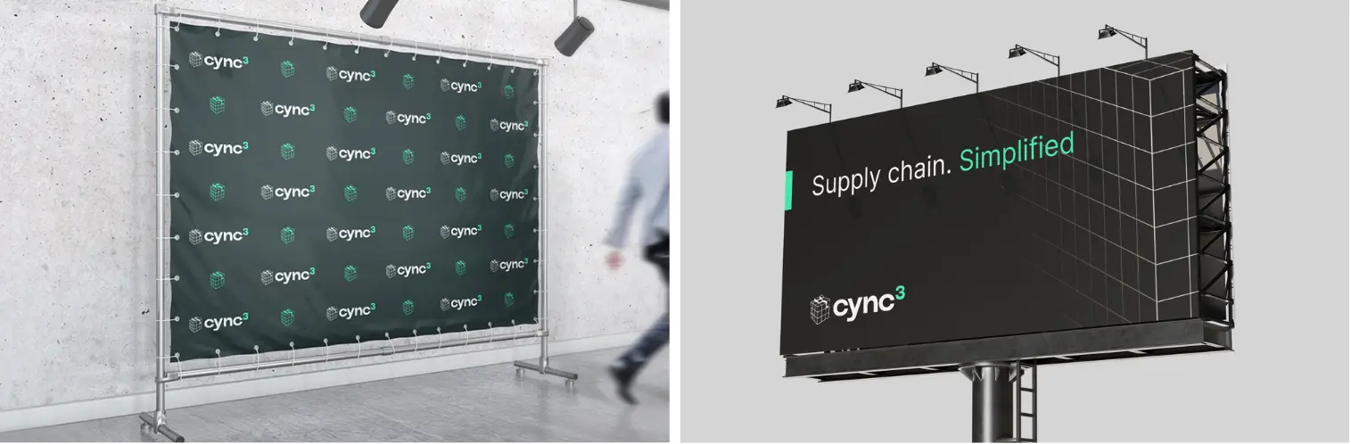
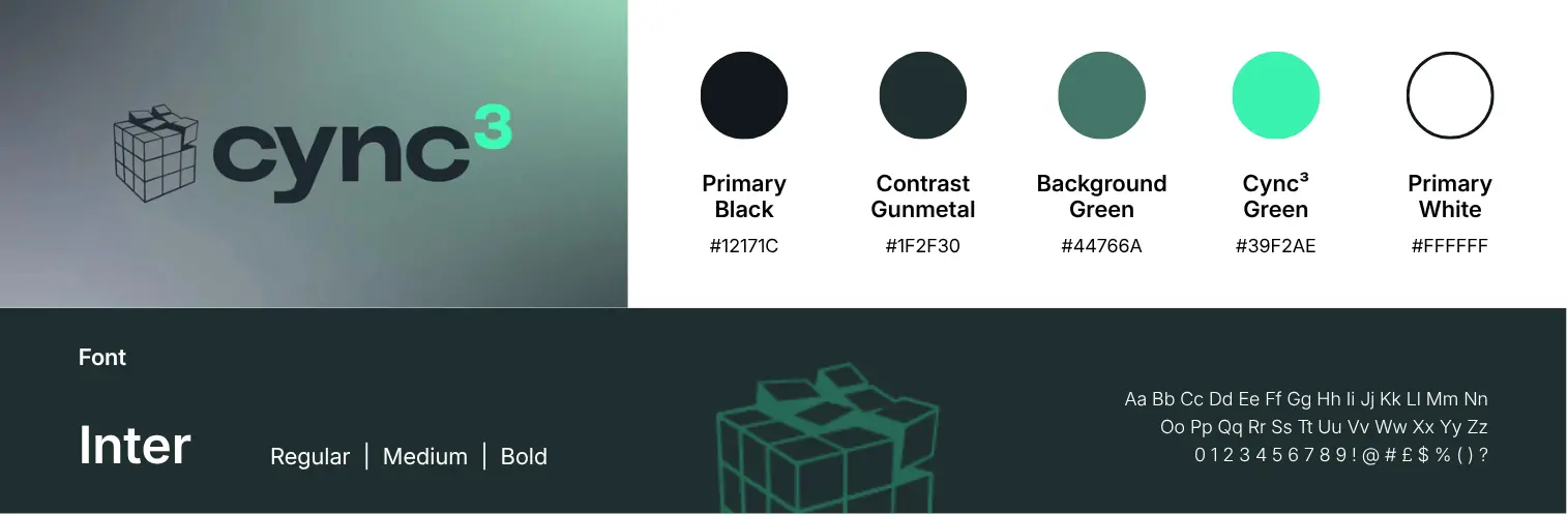
Drawing on its experience as an industrial branding agency, Soto led a full brand refresh and repositioning exercise, resulting in a new identity: Cync³. The name reflects the synchronisation the business brings to its clients’ supply chains, aligning people, process and technology into one efficient system. The cube icon represents the cubic space and precision at the heart of logistics work (cube utilisation in freight, warehouse storage density) as well as structure, reliability and balance, qualities that define the brand’s approach.
Alongside the new name and visual identity, SOTO developed clear brand guidelines and a sharpened value proposition, giving the advisory firm a consistent, professional presence that reflects the precision of its work.
A website rebuild designed to convert
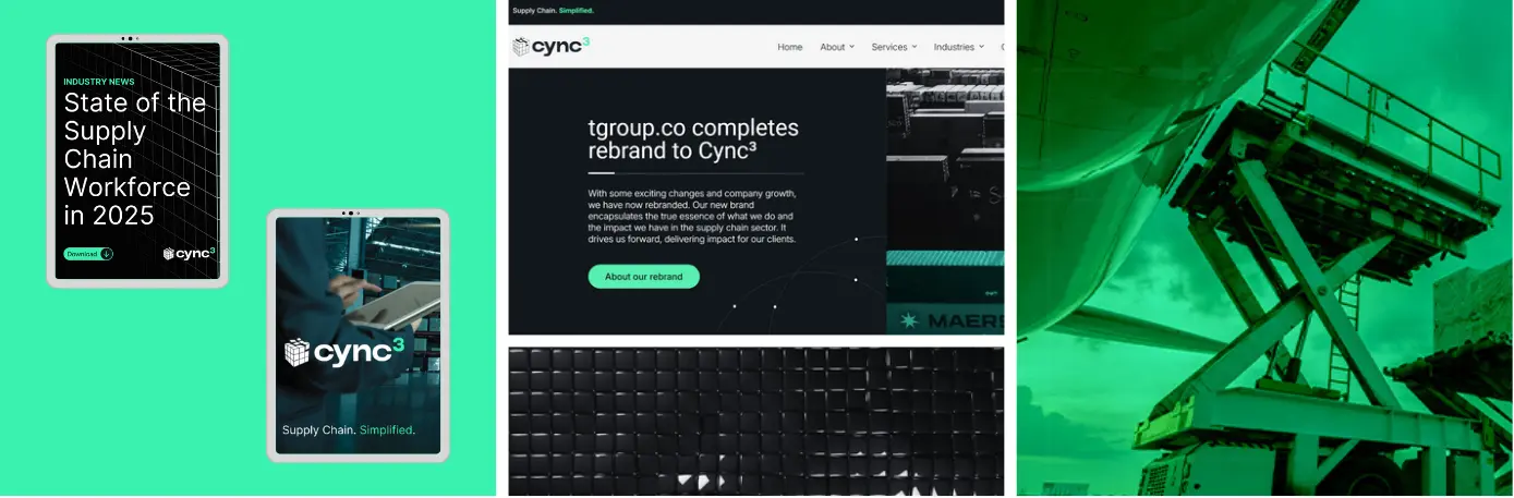
With the new brand in place, Soto Group rebuilt the website, pairing a clean, credible design with search optimised copywriting. The site was built to attract genuine traffic from businesses seeking specialist supply chain consulting, a critical requirement in a considered sector where relationships drive every decision.
A marketing plan to build a genuine lead funnel
This gave the rebrand real commercial purpose, turning a B2B branding investment into a functioning pipeline for the business.
The Results
A Clear Identity and a Foundation for Sustainable Growth
A Logistics Advisor Ready to Scale
The new site drew over 500 new users in its first two and a half months live, with search visibility climbing to nearly 19,600 impressions as the logistics consultancy gained traction for relevant industry terms. Soto’s engagement extended into an ongoing retainer focused on SEO and backlink building for the new domain, laying the groundwork for growth well beyond launch.